My Role
Design System Designer
Timeline
Dec ’25 | 4 Months
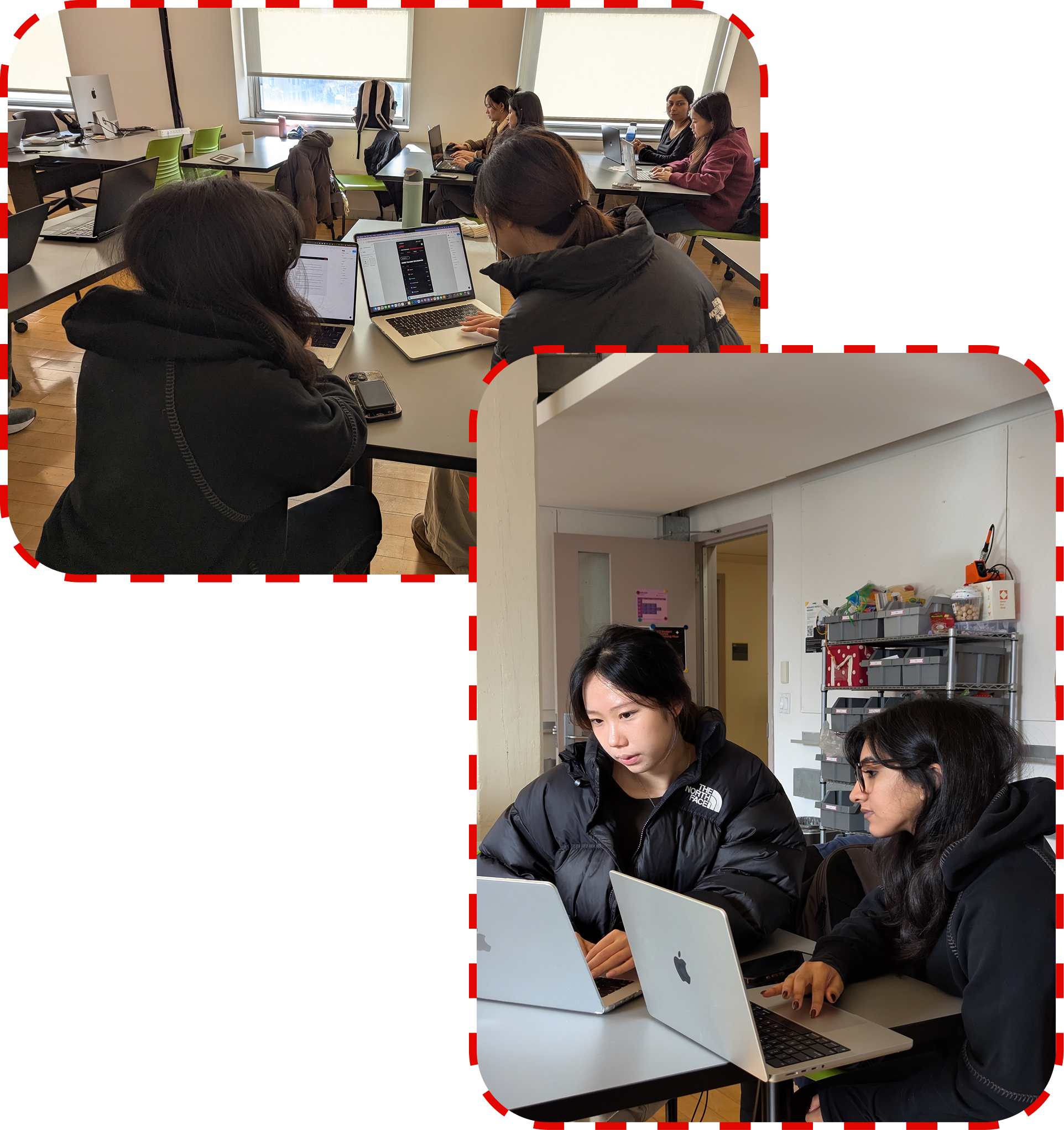
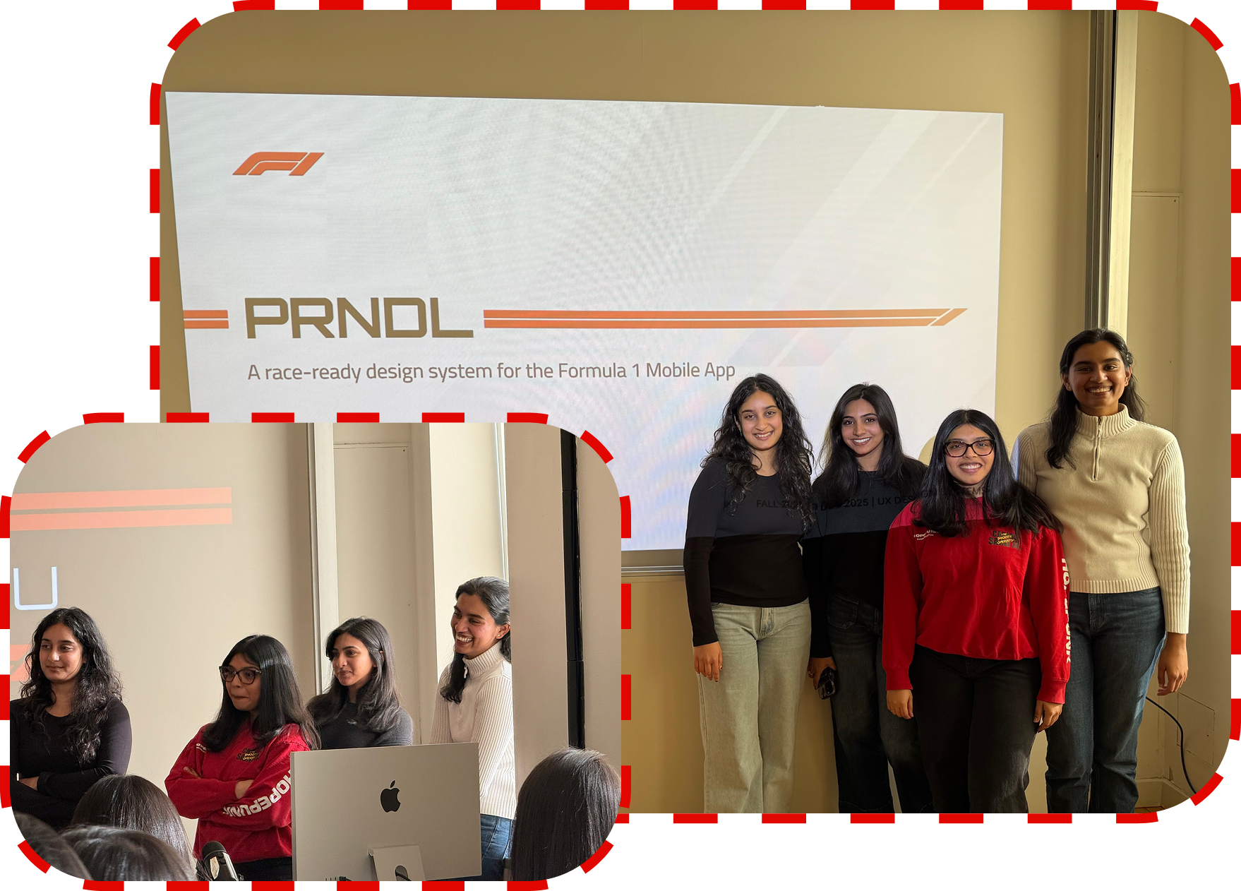
Team
Ritika, Merlyn, Areen, Sisira
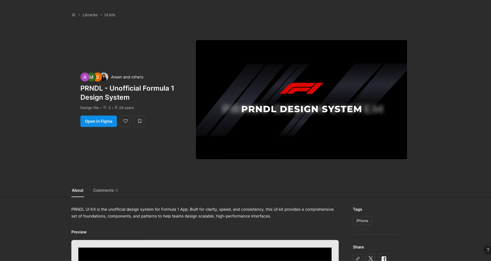
Tools
Figma, Zeroheight
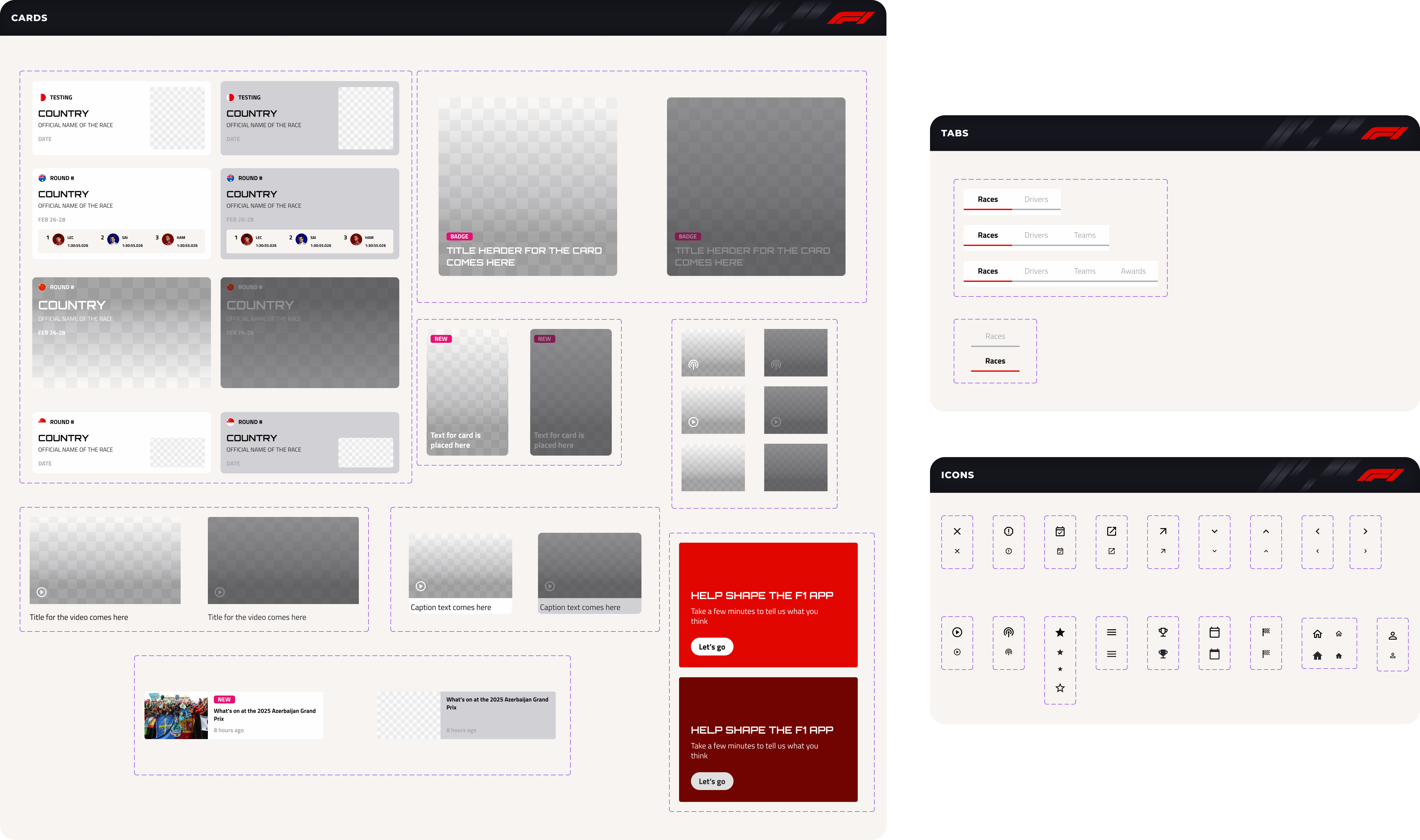
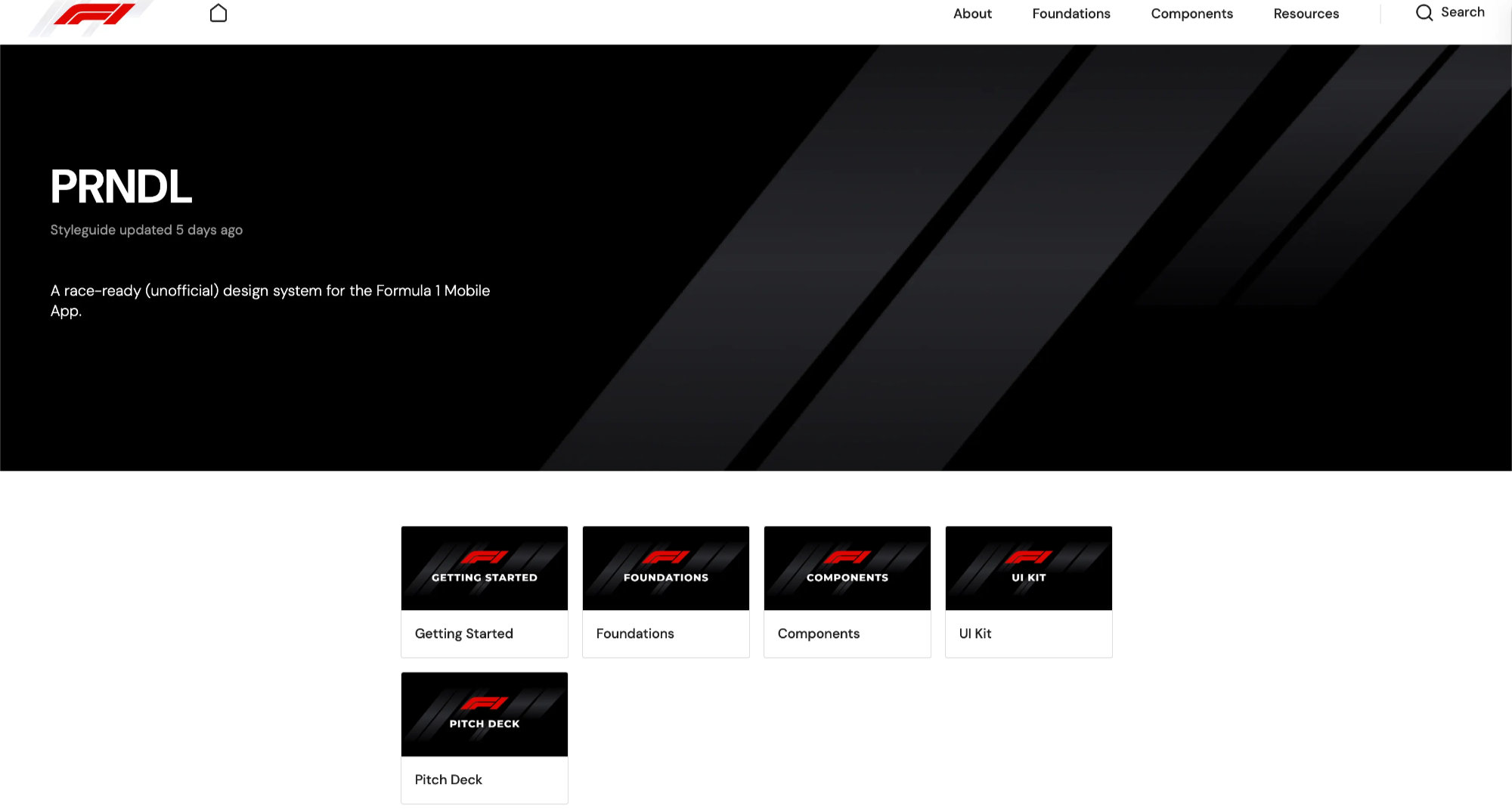
INTRODUCTION
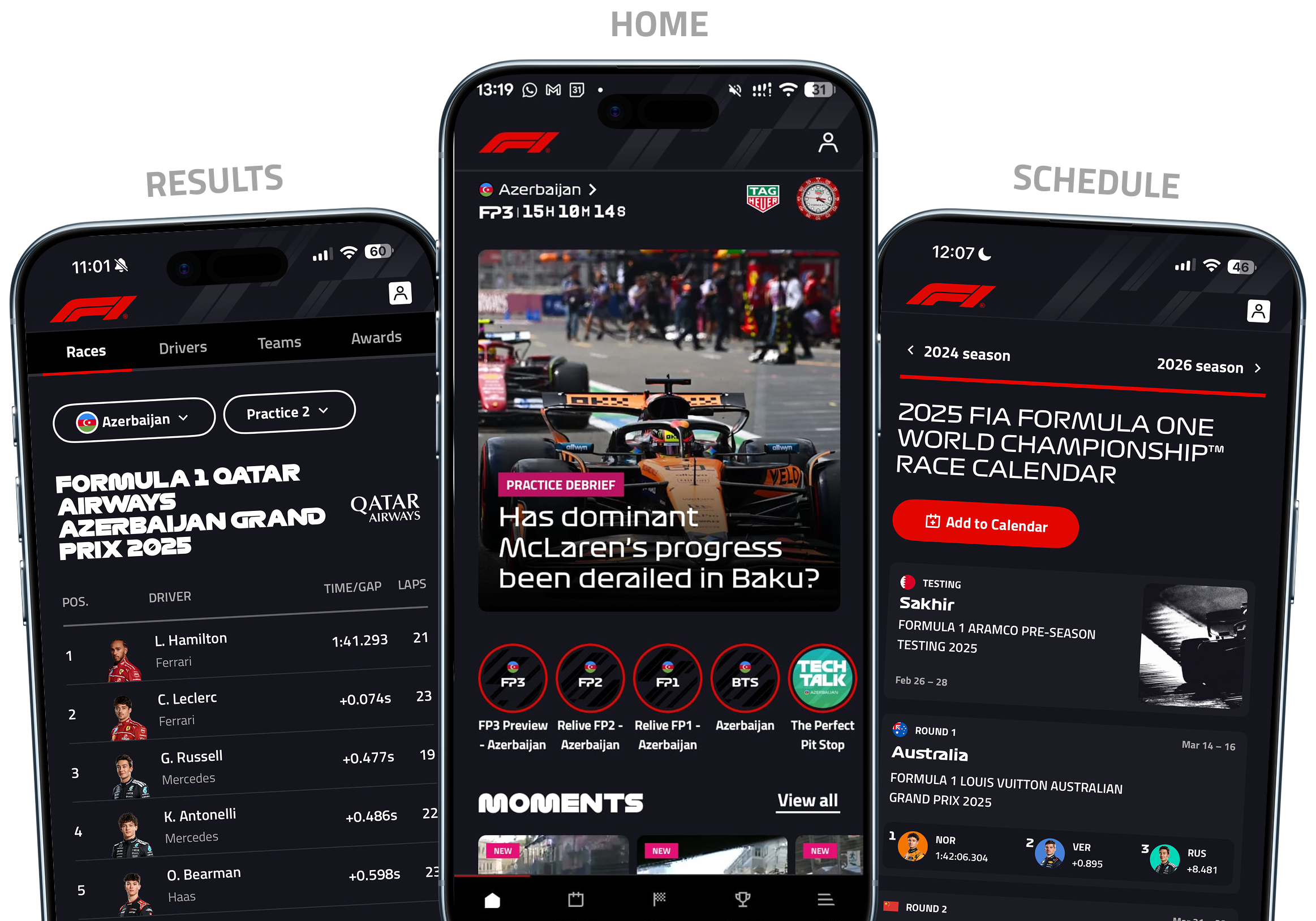
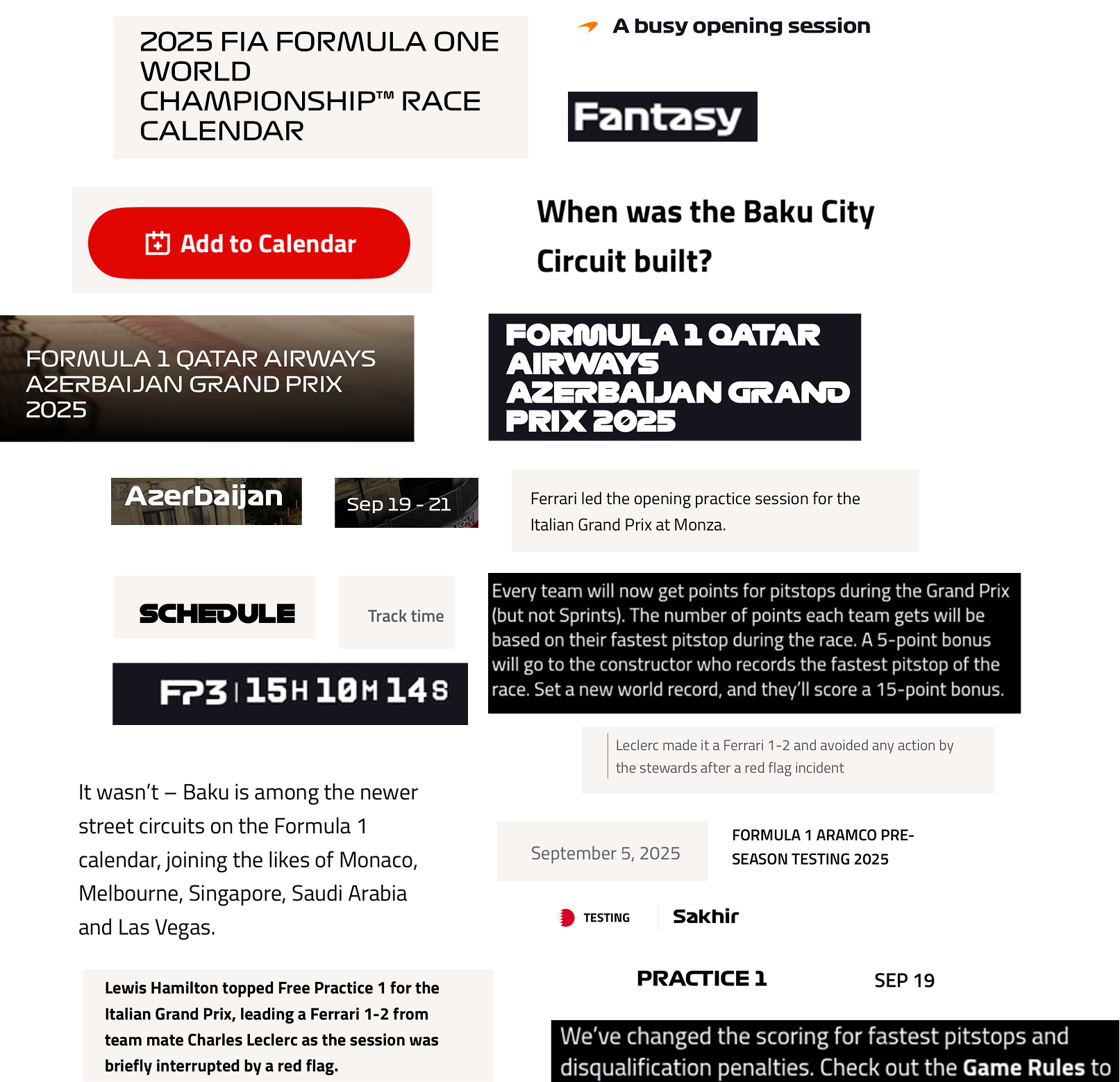
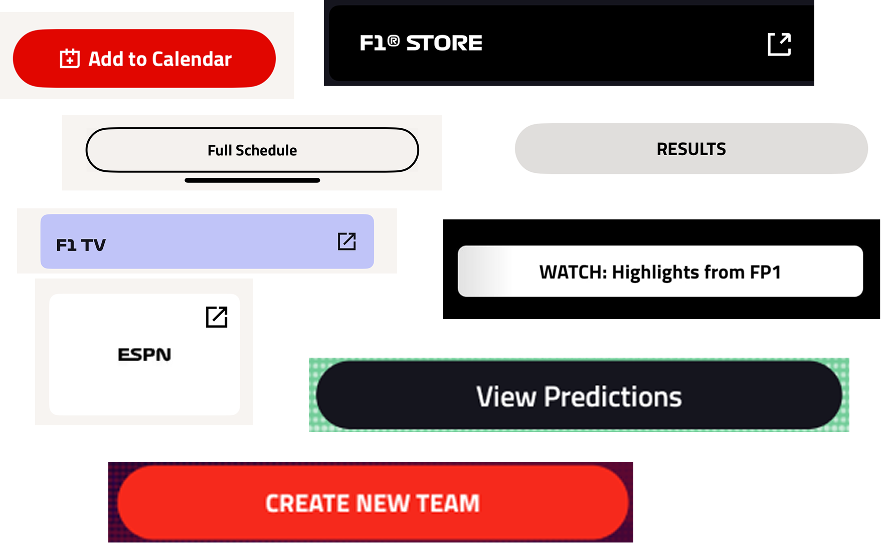
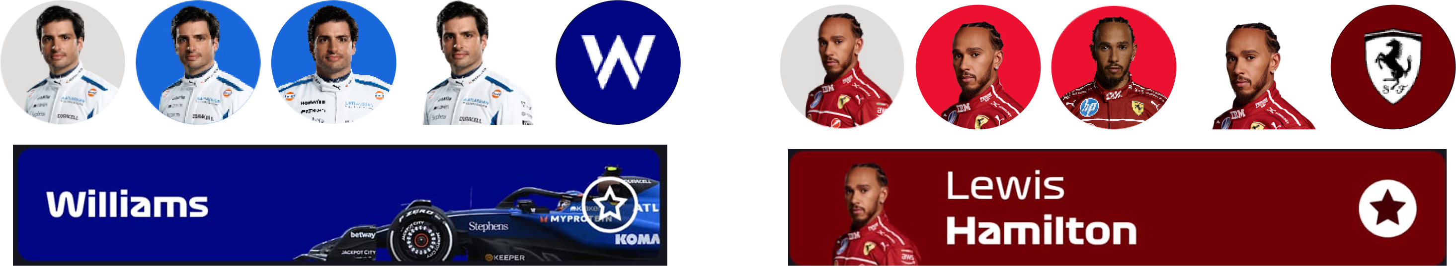
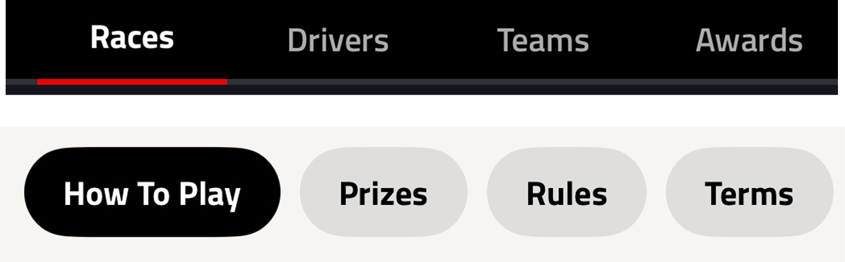
Formula 1 is an international motorsport championship defined by high-performance engineering and competition. The F1 app functions as the official digital platform, centralizing live race data, news, highlights, results, and season scheduling information.
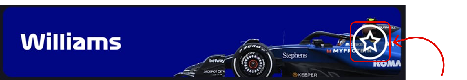
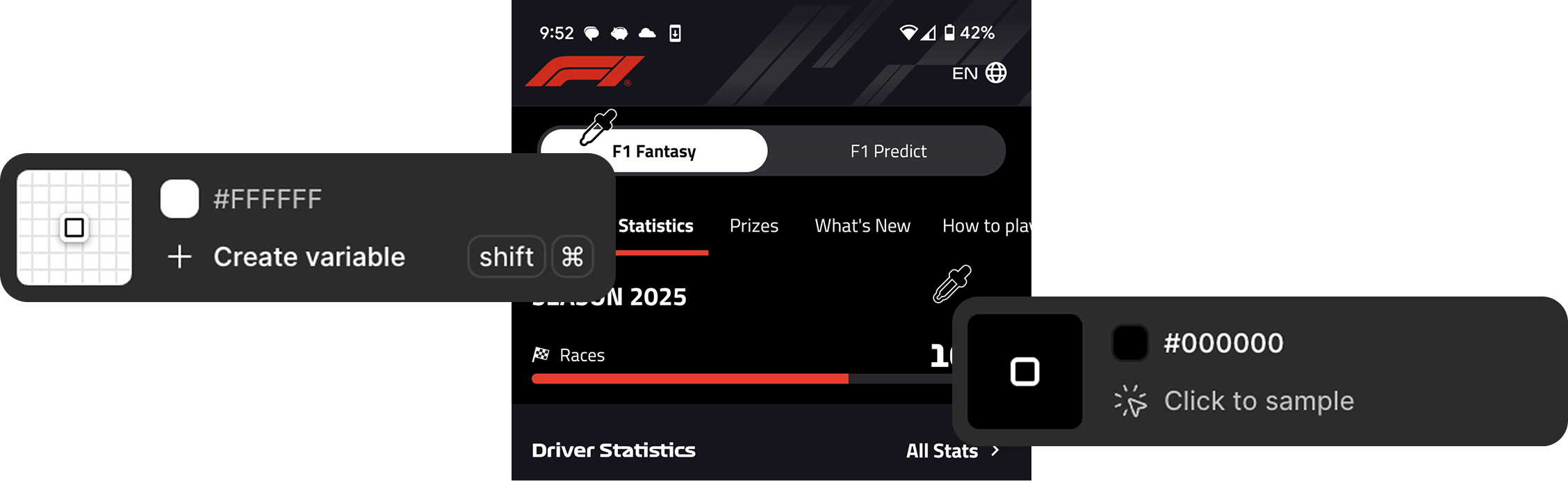
Given the volume and complexity of information presented in the F1 app, the absence of a shared system increases the risk of visual and interaction inconsistency.
The challenge revealed a gap in the product workflow, pointing to the need for a unified design system that enables consistency and efficiency at scale.